ShopDreamUp AI ArtDreamUp

Deviation Actions


Description
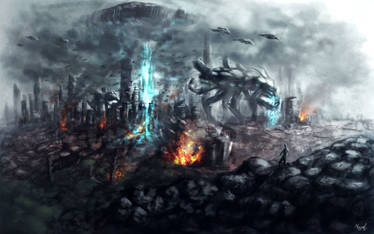
This took way longer than it should have. Save for the buildings, which were rendered in Google Sketchup and then painted over (though I did model it myself), the rest is entirely digitally painted, no third party stock or textures used.
I have a narrative in my head of what's going on, but it's not too important to put down here.
If I take anything away from this, it's a somewhat firmer understanding of how to direct a persons eye over a piece, hopefully I've done it right... I also kind of hope that the feeling that these people are in motion is presented well.
Time took :Approx 40 Hours
Tools: Photoshop, Intuos3, Logitech G13.
Image size
14400x7083px 47.32 MB
© 2012 - 2024 Joshi38
Comments18
Join the community to add your comment. Already a deviant? Log In
The first thing I noticed about the painting is that it is way too smooth. You need to get some texture packs to add texture, which will make it seem more realistic. Adding texture doesn't change the fact that you painted it, the texture just helps add little details that are hard to paint on your own. The shading is also part of that problem, try to not smooth out the shadows as much.
I like the composition and it tends to pull your eye around the painting and lets the viewer take in the scene. I like the clouds in the foreground, but the one curly cloud in the back is a little too formed and takes away from the two people.
I'm a little confused of what is happening (is the boy holding a weapon, does the girl have magic? Is she human to be jumping around like that and is she good or evil?) and I think you should make the narrative a little clearer, perhaps elaborating on their costumes. The buildings in the background could also use a little more detail because I see a few of the buildings look destroyed, but it could be a bit more obvious (more buildings in ruin/falling over).
The anatomy could use some more work, next time use reference (which isn't a bad thing!). The boy's neck is far over to the left, which throws off his whole torso. His leg looks a bit awkward too. I think it would be better to pull his leg forward and instead of being straight to the viewer, twist his torso to be able to shoot at the girl. The girl might benefit from a more dynamic pose, and instead have her feet and arms in different positions instead of being parallel to each other. Their skin tones are very much one color and more study on skin and color could help you with this.
Overall, I applaud you for tackling such a difficult scene. I hope you continue to improve and practice. I suggest you watch some videos on youtube by FZD school for tips on texturing. Good luck! ^^